
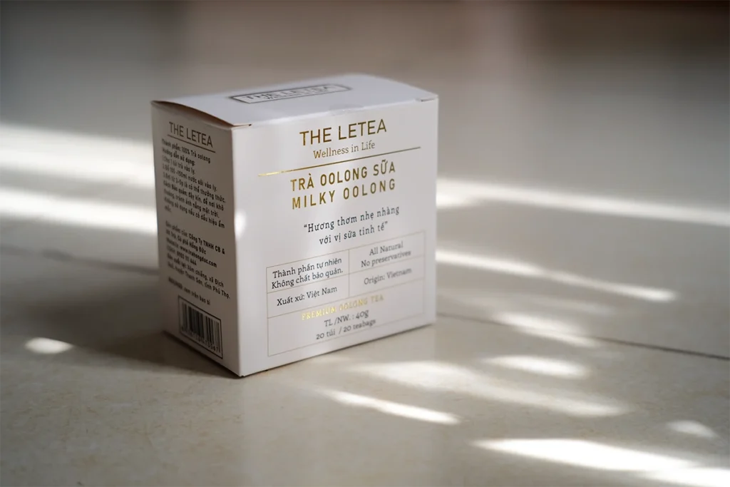
Months ago, I received a tea box as a gift.
At first glance, it feel like a minimal & premium packaging with little detail on the box & white background. When I looked closer, there was a few small design flaws that greatly affected the initial premium feeling.
That’s why I decided to remake it. Let’s try
The flaws
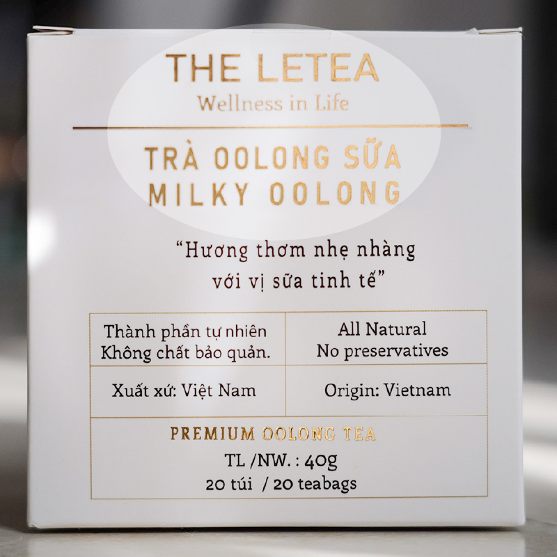
There are no main or secondary factors that distinguish between the brand and the name of the tea. The name of the tea should be the most visible information.
The dividing dash line looks a bit distracting and doesn’t fit the overall look
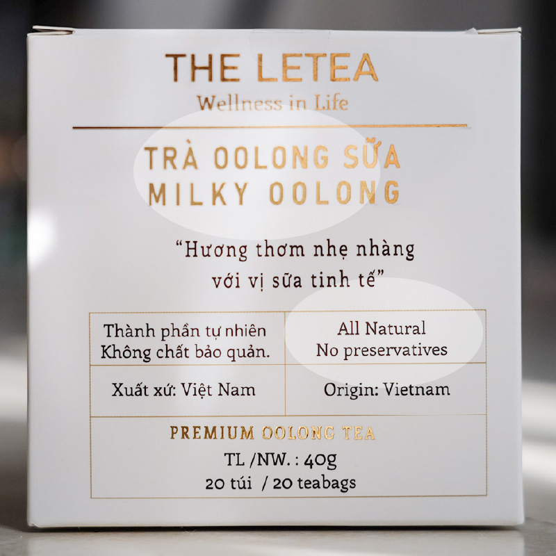
There are no stylish to distinguish between English and Vietnamese words

Should not use center align if you divide the frame into 2 sides like that, it looks confusing.
We can left align it since we have frame
Unbalanced white spaces.
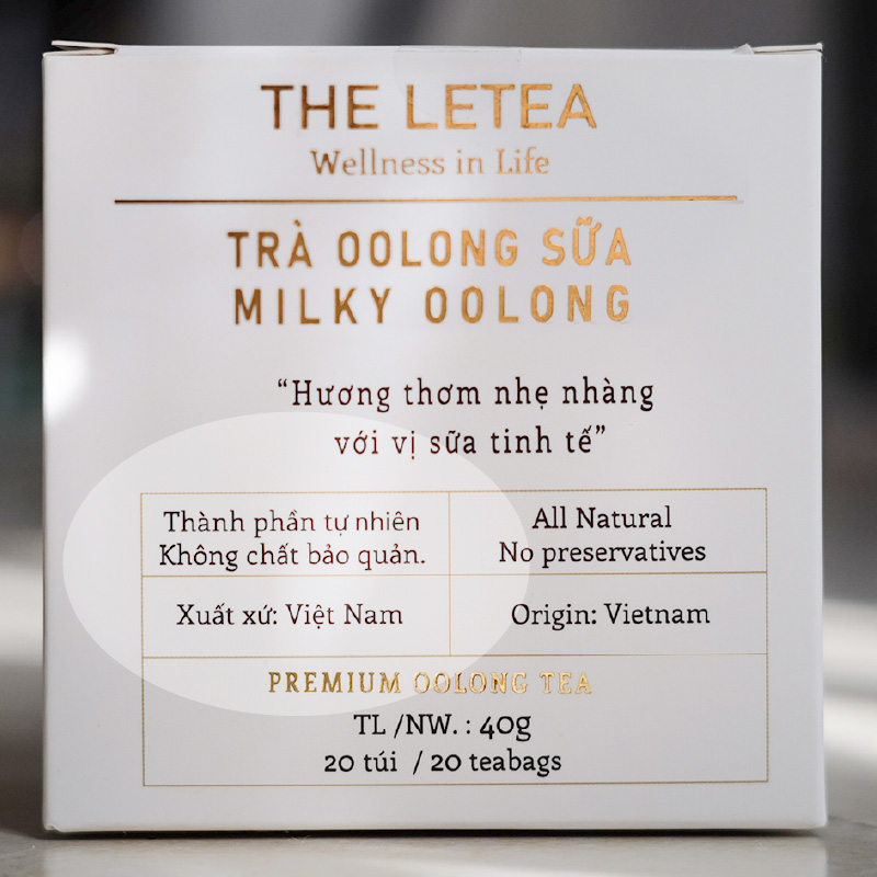
The “Thanh phan” box is too crowded.
The “Xuat xu” box is too wide.
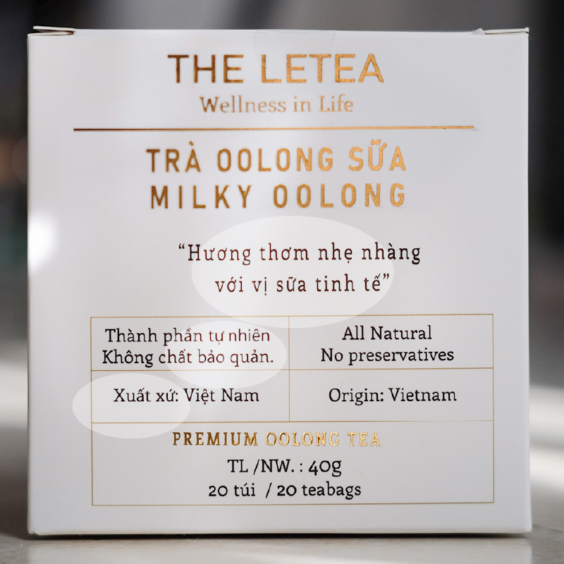
Font is scaled unnaturally.
Minor font errors because of bad use of font type.
The redesigns – Option 1
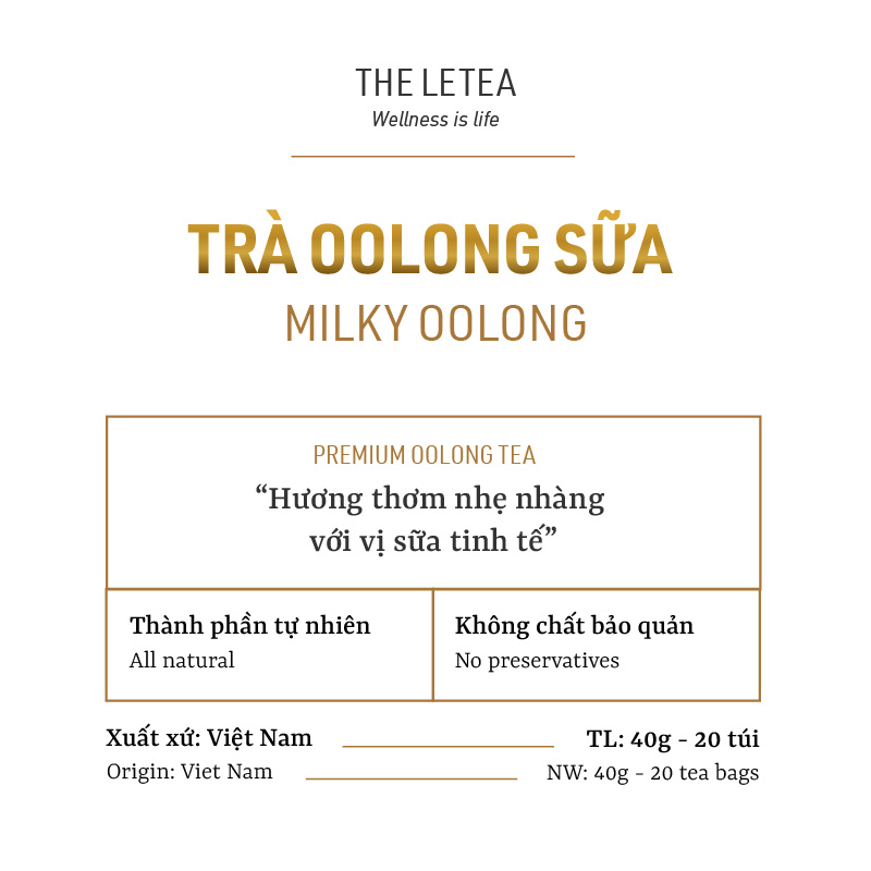
Clean all the flaws mentioned above.
Frame the “Huong thom…” box for a more solid composition.
Outside the box are 2 information: Xuat xu Vietnam and TL (this information is usually outside the description box)
The redesigns – Option 2
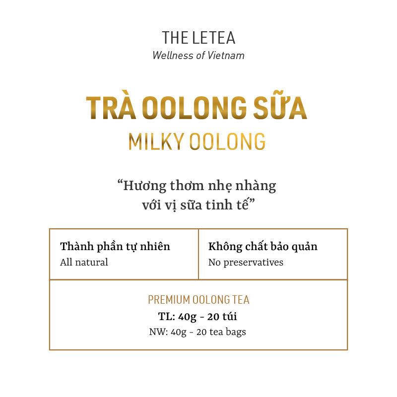
Clean all the flaws mentioned above.
Remove “Xuat xu: Viet Nam”, suggested placing it in the information box.
Replace by changing the slogan Wellness in life (a bit obscure) to Wellness of Vietnam